
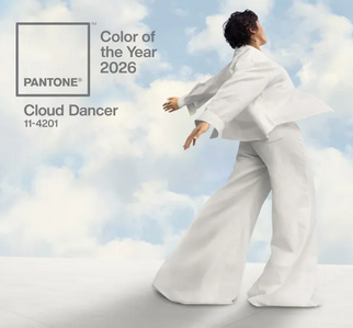
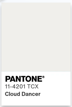
on Pantone’s Color of the Year 2026
I’ve been waffling for a long while now about sharing my thoughts and learnings while deconstructing Christianity and Whiteness and generally the real-time evolution of my larger Silly Little Philosophy. I could list all my excuses for not returning to long-form posting sooner, but it mostly boils down to: I am scared. Which is a terrible reason not to do something, in my opinion. I could get into the nuance of the whys of my fear, but that is for a different post.
If I’ve learned anything on my unlearning journey, it’s that I will probably look at this in a week, in a month, and cringe at how little depth there is in my understanding. BUT! I know I’m not talking out of my ass about design. I know the intentionality that lives behind every decision that makes it to the final audience.
Pantone announcing their dismal (and frankly alarming) choice of color of the year is the pebble in my shoe that pushed me to resurrect my blog and do something with it. At best, it was rage bait. At mid, it was a tone deaf attempt to stay relevant during the one time of year they get a lot of mainstream attention or perhaps it was their attempt at social commentary. At worst, it was a blatant dog whistle they felt comfortable showcasing as the undercurrent of white supremacy in the United States positions itself more solidly as an openly acceptable stance. It is hard for me not to see it as the latter.
There are three main things that came together and led me to this conclusion:
Pantone has always had shady practices. In fact, it’s part of the reason I decided to stop pursuing larger clients when I was a freelance brand and identity designer. For context: I worked with small businesses – mostly sole proprietors and entrepreneurs in the early stages of building and launching their businesses – zero in on the personality of their new enterprise and how they wanted it to move, look, and feel as its own entity separate from their personal selves. I lived in the nitty gritty details of color, form, balance, and perception.
In the last 5 years, I also actively searched out educators on anti-racism and divesting from white supremacy. In these spaces I have learned about the subtlety of dog whistles and how insidiously I was conditioned to excuse them due to the plausible deniability built into their very intention. I recognize that I only have the information I do because of my active attempts to work against the cultures that built the society I live in.
I spent more time than I care to admit reading Threads regarding Pantone declaring literally any shade of white as the social indicator for 2026. On one side there are those who see the underlying white supremacy calling out Pantone’s clear reinforcement of white as default. On the other side, we have the “it’s not that deep” crowd telling the first group that they’re overreacting and claiming “not everything is about race” as if this country wasn’t literally founded on the ideals of rich, white men who brutally massacred anyone who stood against them or threatened their power.
Pantone describes Cloud Dancer as an “expansive presence” that “build[s] an atmosphere of serenity and spaciousness, providing a refuge of visual cleanliness that inspires well-being and lightness”. This immediately sets off alarm bells as this only makes sense if they are centering white as a default. What I mean when I say this is white and minimalism have long been used as a strategy to erase culture. White in design has often signified wealth, status, and class. Cultures of the global majority often incorporate lots of color. When forcing assimilation, art, fashion, and design centering the color white and minimalist trends strip these cultures of their individuality and uniqueness in favor of what those in power deem acceptable.
Pantone is an industry standard. They are aware of their cultural impact. They are experts in color and do not make these decisions in a vacuum. Laurie Pressman, the Vice President of the Pantone Color Institute, said in a 2023 interview about how the color of the year is chosen that it “reflects what is taking place in our global culture at that moment in time” and that it “represents a global lifestyle trend positioning them as the global authority on color”. She goes on to explain that “the goal of the program is to help companies and consumers better understand the power color can have. We want to teach them how to leverage color’s power and expressiveness to influence perception.”
Pantone already established patterns of elitism in 2022 when they removed their color books from seamless integration with Adobe (another industry standard) and put their colorbooks behind a subscription based paywall often falling on the artists themselves to pay more to keep the colors or risk them being replaced with black in their designs. To continue beyond this capitalist greed (which has roots in white supremacy as well) and claim that white is the optimal color for progress and resetting the industry for the future is worrisome.
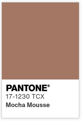
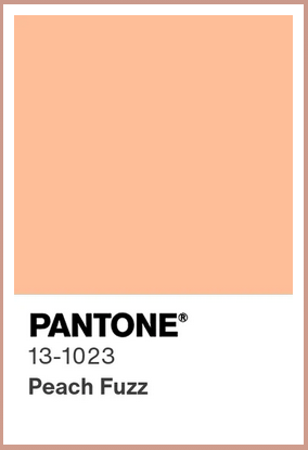
They are not bold enough to say it with their whole chest, though. They are sure to leave enough wiggle room to claim ignorance when accused of racism or classism. It allows for Pantone President Sky Kelley to claim they just want to “spark conversation that everyone can participate in.” They have previously been critiqued for choosing colors that evoke skin tones in the past: Peach Fuzz in 2024 and Mocha Mousse in 2025. It is hard for me to believe they did not consider the racial interpretation of choosing WHITE as the color for 2026. White as the indicator for 2026 in cultural trends ranging from fashion to interior design to marketing and business is hardly unintentional.
The reasons they state for choosing “Cloud Dancer” include:
Universality of looking up and connecting with the drifting lightness of clouds
Suggestions of inner peace after clearing the noise
Ability to be receptive to what can be and what’s ahead
Represents a blank page to turn inspiration into reality
A desire for a fresh start
For these same reasons, an argument could be made that a shade of black could be just as effective. Imagine for a second if this were the case (made up color name for example purposes):
Color of the Year 2026 “Star Dancer” is a subtle purple-black evocative of the expanses of space. It suggests the serene quiet that comes after rising above the noise of the atmosphere and floating, weightless, in zero gravity. It reminds us of the energy and progress of the space race, providing an ability to be receptive to what can be and what’s ahead. A fresh new beginning of exploration. It represents the blank space of the cosmos full of mysteries waiting to be discovered.
Why did they choose white when its complement is just as strong an argument for the same things? Could it be those influences of current events and trends Pressman referred to in that 2023 interview? If their goal is to teach the industry leaders that color has power, why default to whiteness?
In a world where we are watching the rise of fascism in the United States and several genocides play out on a global stage in multiple countries –notably including Palestine, Sudan, Myanmar (Burma), and Democratic Republic of Congo– it is near impossible for me to believe that white as an indicator of white supremacy was not a factor in the decision to make “Cloud Dancer” the color of the year for 2026.
While there is always the chance that the color of the year coincidentally speaks to a complex cultural weave in one of the leading players in global economics, evidence of highly intentional choices and awareness of social impact leads me to conclude that those in the rooms where “Cloud Dancer” was chosen knew what they were doing when they chose it. As Kelley says at the launch event, Pantone doesn’t dictate the conversation, they facilitate it. We will likely not get a direct response about Pantone’s intention in their choice for Color of the Year, but one thing is for certain: they have certainly sparked conversation and everyone is participating.